Parallel
Scheduling software is a sea of soft blue sameness. Parallel hired Chronicle to make theirs impossible to mistake for anyone else's — from the marketing page down to the empty states.
Client
Parallel HQ
Role
Design lead
Services
Web design · Dashboard UI · Design system
Year
2025
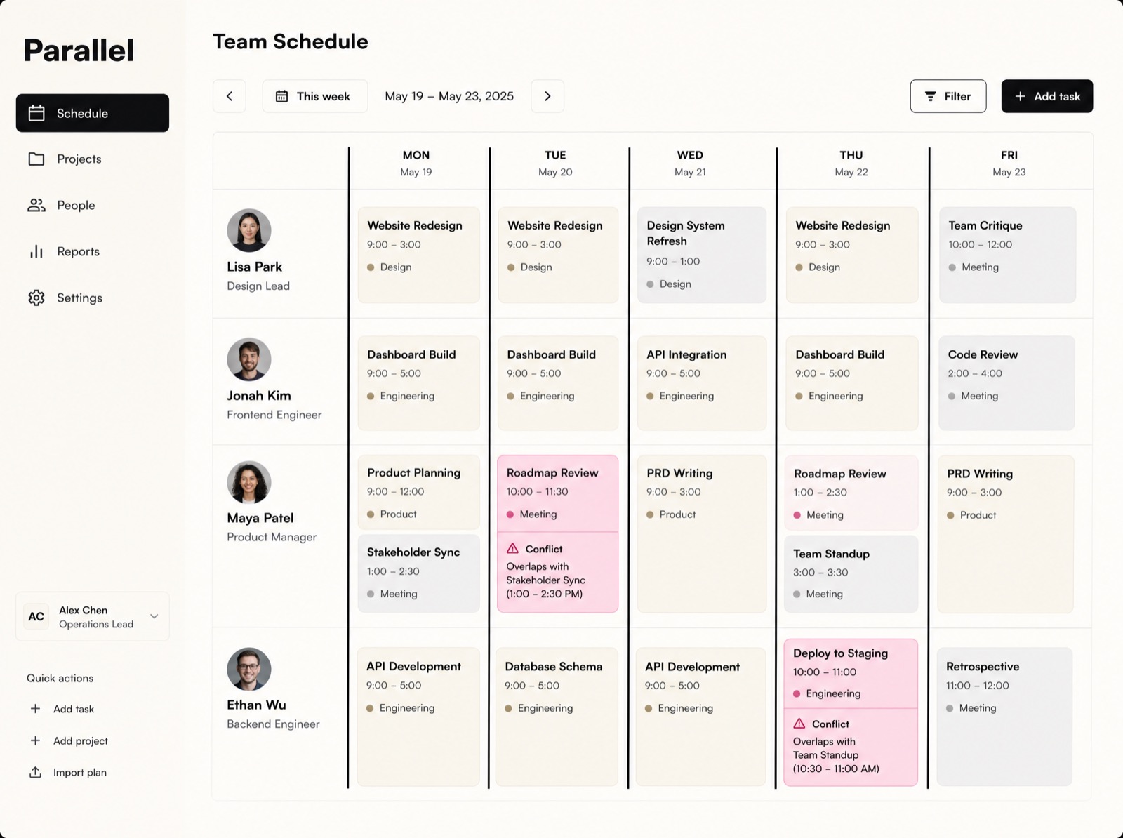
Every scheduling product demos well and looks identical. Parallel's founders had a sharper wedge: conflicts. Their engine catches double-bookings and crunch weeks before they happen. So we built the whole visual identity around the moment of collision.
Make the conflict the hero
The signature element is the flag — a hard pink marker that cuts across the week board wherever two commitments collide. It's on the landing page, in the product, on the T-shirts. Where competitors soften their UI to feel calm, Parallel points at the problem and says: there.
The rest of the interface earns that loudness by being ruthlessly quiet — ink rules, generous whitespace, one type family, no decoration that isn't information.
Shipping the system
- A shared token set between marketing site and app, so the demo is the product.
- Empty states written like a good coworker — specific, brief, occasionally funny.
- A component library the in-house team now extends without us, which was the point.
We stopped looking like a feature and started looking like a company.Robin Reyes — CEO, Parallel
Six months post-launch, Parallel's demo-to-trial rate had doubled, and the pink flag had become shorthand in their sales calls: nobody asks what the product does anymore.
Want results like these?
Start a project