Brutalism is a budget decision
The style everyone calls a trend is actually the cheapest honest design language on the web — if you understand what it's spending instead.

Marlo Vane
Chronicle Studio
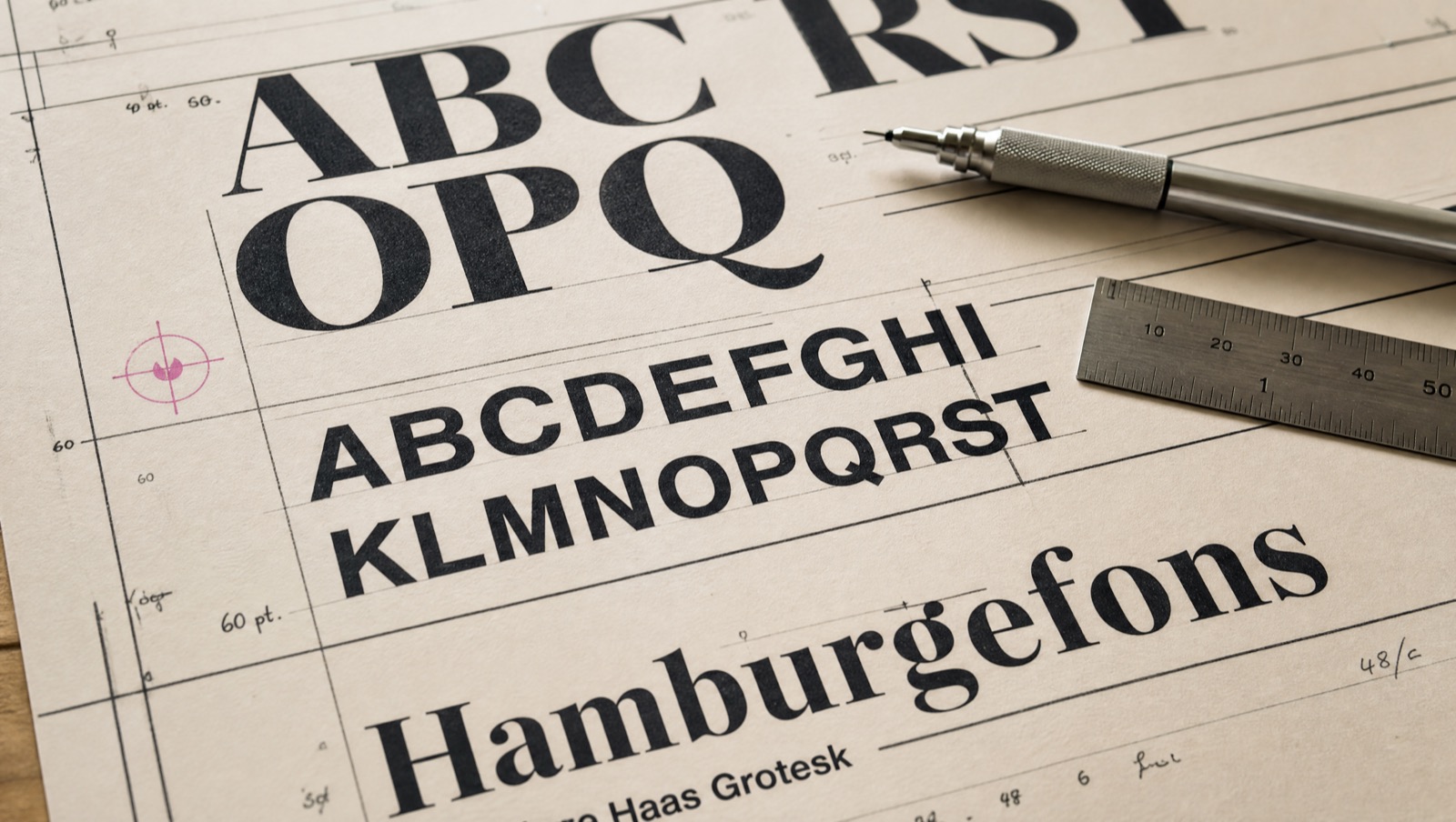
Web brutalism gets written up as an aesthetic rebellion. Sure. But strip the think-pieces away and you find something more practical underneath: it's the design language that spends money where users can feel it.
What the style refuses to buy
No stock photography of people laughing at salads. No gradient meshes rendered in someone's GPU farm. No icon set that needs a licensing call. A brutalist page is type, rules, and honest color — assets you already own the moment you can write a sentence.
Where the budget actually goes
Into the words. A page with nothing to hide behind lives or dies on its copy, so you finally pay for good copy. Into the type — one great family beats six mediocre ones and costs less. And into speed: pages built from text and borders are light by construction. My last three launches shipped under 90KB before fonts. Nobody's gradient mesh does that.
A style that can't hide bad thinking forces good thinking. That's not a constraint — that's the product.
The honest caveat
Brutalism is cheap to build and expensive to fake. Because there's no decoration to absorb error, a sloppy brutalist page looks broken rather than boring. The rules have to be exact, the spacing deliberate, the hierarchy airtight. You're not spending less craft — you're spending it where it shows.
Which, if you ask me, is the only place worth spending it.
Enjoyed this? There's more where it came from — read the journal or start a project.